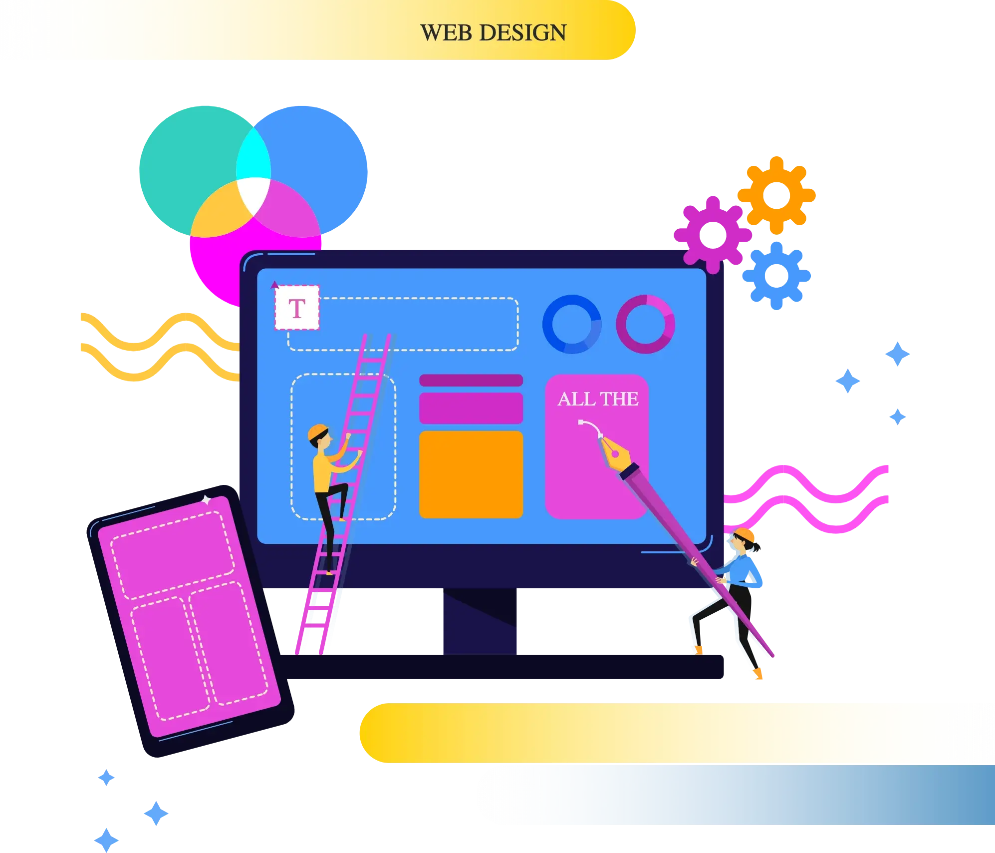
Creating a website that works smoothly on any device is often harder than it seems. Many businesses face problems with how their websites look and feel on different screens. Responsive Web Design solves this, but it’s about more than just fitting content. It’s about making sure it functions perfectly everywhere.
At Differenz System, we build websites that adapt to your audience’s needs. With a focus on custom solutions and real-device testing, we provide experiences that meet user expectations no matter the device.
Get Started NowNot every user experiences a website the same way. Some may use screen readers. Others may rely on keyboard navigation. Many browse on phones with zoom or high contrast modes. A good website supports all of them.
Accessible design is not only for people with disabilities. It helps everyone. Clear layouts, readable fonts, and simple buttons all improve usability for users across all devices.
What Differenz System focuses on
Responsive Web Design (RWD) adjusts a website’s layout for different screen sizes, but it does not inherently support offline functionality. To provide offline access, additional solutions such as service workers are necessary. These tools allow users to interact with websites even without an internet connection, creating a more reliable experience.
What Differenz System Provides for Offline Features
Having a website that adjusts to different screen sizes is a must. We at Differenz System design websites that provide a smooth experience across all devices, from mobile to desktop.
A confusing website can drive visitors away. Our team focuses on crafting user-friendly designs that guide visitors to find what they need and keep them engaged.
Your website’s code affects how well it performs. At Differenz System, we write clean, responsive code to make sure your site runs smoothly across all devices.
With more users browsing on mobile devices, Differenz System makes sure your site is fast and easy to use on smartphones and tablets.
It’s important to test your website on multiple devices. Our team conducts thorough testing across various platforms to make sure your site looks and works well everywhere.
Each business has unique needs. We provide custom web solutions to meet those needs and deliver the best user experience for your target audience.
If you want a simple, flexible platform, Differenz System offers WordPress development. WordPress websites are easy to manage and responsive across all devices.
Migrating your website to a new platform? Our team moves your content smoothly, without compromising SEO or losing important data.
Responsive design is not only for websites. Apps and admin panels also need to work well on screens of all sizes. At Differenz System, we build both web and app interfaces that are fully responsive.
Responsive web design aims to make websites work well on all devices, but there are common issues businesses face. Here's how Differenz System helps solve them
Websites need to adapt to different screen sizes, causing display issues if not handled well. Differenz System uses real-device testing and flexible design to make sure your website looks great on all screen sizes.
Mobile users often experience slower loading, leading to poor user experience. We improve speed by optimizing images, scripts, and performance, making sure your site loads quickly even on mobile.
Websites often struggle with SEO on mobile devices, hurting search rankings. Differenz System uses mobile-first principles and optimizes your website for better performance and higher SEO ranking.
Keeping the design consistent across various devices can be difficult due to different screen resolutions. Our team ensures the design stays consistent on all devices with responsive layouts, making it easy to use on any platform.
Small screens can make it hard to interact with a website if elements are too small or hard to touch. We create touch-friendly navigation with clear buttons and forms for a smooth experience on mobile devices.
New devices are constantly introduced with different screen sizes, and websites need regular updates to keep up. We update designs regularly to make sure your website works on the latest devices and meets changing user needs.
 Dart (Flutter)
 JavaScript
 Swift
Swift
 Flutter
 AngularJS
 Vue.js
 React.js
Flutter
React.js
Flutter
 ASP.NET
 React Native
 Xamarin
 Firebase
 MongoDB
 MySQL
MySQL
 PostgreSQL
 Amazon Web Services ( AWS )
 Google Cloud Platform
 Microsoft Azure
 Firebase
 Docker
 Kubernetes
 Jenkins
 GitHub Actions
 Selenium
 Appium
 JUnit
JUnit
 XCTest
Improves user experience on all devices
Increases mobile traffic and interaction
Improves SEO rankings for mobile sites
Lowers maintenance costs with one design
Builds trust with consistent design
Adapts to new devices and screens
Improves website load speed
Start Your ProjectWe’re here to help you with responsive web design.

Hear from our clients
Differenz have provided London Sport excellent web development services across three products. We have been delighted with all areas of their work; expertise, technical knowledge and account management. We have asked Fazil and his team to take on the rebuild of an existing product, the ongoing development of another and build another from scratch – on all they have exceeded expectations.

The team have worked in a few projects for me: some from scratch and some fixing the work of other developers. They’ve always been responsive, professional and done a great job. I continue to use them for all of my website and app development tasks.

Differenz have been providing ongoing app and web development services to us for the last two years. They have great expertise and we have always found their work of the highest quality, even when handling extremely complex requirements. They also provide great customer service, with our account manager always on hand to talk through requirements and issues. Highly recommended!

 Automotive
 Banking & Finance (FinTech)
 Construction
 Education
 Entertainment
 Healthcare
 Insurance
 Manufacturing
 Real Estate
 Retail
 Telecommunications
 Transportation & Logistics
 Hospitality
 Travel & Tourism
 Agriculture & AgTech